
< Back to home



Usable but useless
5
Why not listen to this article while you work?
AMC creates hundreds of materials for our clients each month. However, an engaging, successful material needs to have good levels of both utility (required features/content) and usability (how easy and pleasant those features are to use) in order to be fit for purpose. We need to be mindful not to ignore the former in favour of the latter. Otherwise, we’ll end up with materials that are pleasant to look at but have no reason to exist. Serving no purpose for the end users.
A good way of thinking about it is to strive for ‘minimum desirable products’, rather than ‘minimum viable products’.
As Jakob ‘King of Usability’ Nielsen explains, “One of usability’s most hard-earned lessons is that ‘you are not the user’.”
Something our clients and we need to keep front of mind for everything we produce. Let’s focus on the user and what they desire. The cornerstone of good user experience (UX) is human centred design (HCD).
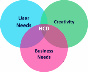
What makes something usable but useless?
- Design interfering with the messaging – less is often more. You don’t need dozens of stock images of happy, smiley people or hundreds of icons. The creative theme shouldn’t overwhelm the writing.
- Content of no interest to the end user.
- Content and its call-to-action not meeting the objectives of the client.
- Too long; didn’t read (TL;DR) – concise content is vital to communicating key messages. Just because a 30-page PDF already exists, it doesn’t mean it should be put on a booth where no one is going to spend the time reading it. Convert it to a one page summary and offer the option to have the deep dive PDF emailed to the user. Avoid overcommunicating. Use conversational writing, when appropriate.
- Too many messages – don’t try and cram War & Peace into an A5 leaflet. Effective materials have a single call-to-action.
- Wrong format – would it be better as a podcast or video instead? Does it need to be a hologram? Probably not!
- Poor accessibility – we are all less able some of the time. Always design with accessibility in mind.
- Counterintuitive interactivity – users may not be aware the activity is interactive. Resist the temptation to include interactivity for the sake of it.
- Unhygienic – some users don’t want to share headphones, VR headsets or touchscreens with other people.
The needs of ordinary users are easily neglected in favour of a utopian design vision. This is apparent in congress hall booths that are awash with touchscreens competing with one another. It’s also apparent in modern architecture. Big cities are becoming a sea of uniformity. Expensive glass skyscrapers – empty monuments erected not for their users, but for the people who built them. Designing for industry, not people.
Is there a better way?
If we want to design more useful materials or products, we need to stop jumping to formats and solutions too early and start with a discovery phase: a process that helps us understand the problem properly so we don’t just design things better, but design better things.
Frame the problem and maximise the opportunity 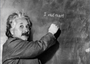
A wise man (Albert Einstein) once said:
“If I had an hour to solve a problem I’d spend 55 minutes thinking about the problem and 5 minutes thinking about solutions.”
- For whom are we solving this problem?
- Which user needs/challenges are we trying to address? If there is an existing material/product, what shortcomings do we need to fix?
- What insights do we have to inform the solution (e.g. analytics, research, competitor analysis)?
- How will solving this problem help our clients/us?
- Why are we/the client capable of making this solution a success?
- How will success be measured?
The answers to the above will always result in useful insights. Those can be used to explore and assess multiple solutions before choosing the most suitable one. Ensuring it is optimised for the best user experience possible for maximum engagement.
There are many shiny objects out there, and if we focus on these (because our clients want to impress their peers or managers by having the most shiny booth) it will be at the expense of usefulness. Good design doesn’t get in the way of the content and the messages/call-to-actions we are looking to communicate to our audience. Less is often more in today’s age of social media and diminishing attention spans.
“I don’t know the key to success, but the key to failure is trying to please everybody.”
– Richard Pryor
We cannot let the allure of the visual, or the temptation to include too much content, tear us too far away from the usefulness of the products we develop.
Would you like to discuss further?
Contact Ben Horner
or another member of your Digital Engagement Team
Header images source: https://plainmagazine.com/15-useless-product-designs/
Book in work

Got an idea for an article?
Co-author with us
Co-author with us
- Interactive learning module demo*
- Creative Credentials
- Publication offerings
- 2D animation showreel
- 3D animation showreel
- PowerPoint showreel
- Interactive and booth attractions*
- Scrolling video demo*
- Quiz game demo
- NFC technology demo*
- 360 Gallery (VRLite) demo*
- Ashfield Arcade - demo games*
- Synthesia guide & demo's
* Login Details:
Username: ashfield
Password: amccreative

Who is in my pod?
Alternatively, View the whole team

Hannah Tooth
Creative Planning Manager
Whitney Sherratt (Maternity Leave)
Creative Lead

Jake Johnson
Senior Designer

Lottie Newall-Smith
Creative Artwork Lead

Freya Nicolaysen
Presentations Designer

Alex Ford
Creative Operations Lead

Abi White
Associate Creative Director

Hannah Magill
Creative Artwork Lead

Geri Aleksandrova
Senior Creative Artworker

Danielle Greaves
Creative Artworker

Robbie Macoy
Presentations Lead

Zoë Dixey
Creative Planning Manager

Staci Hocknell
Senior Concept Designer

Pete Dewhurst
Senior Creative Artworker

Sam Berndt
Presentations Designer






 Not sure? - Why not start a conversation by using the links on the home screen.